CHAPTER TWO
Descriptive Statistics
2.1
Introduction
The description of a data set includes, among, other things:
- Presentation of the data by tables and graphs.
- Examination of the overall shape of the graphed data for important features, including symmetry or departures from it.
- Scanning the graphed data for any unusual observation that seems to stick far out from the major mass of the data.
- Computation of numerical measures for a typical or representative value of the center of the data.
- Measuring the amount of spread or variation present in the data.
2.2
The Population and the Sample
Population: A population is a complete collection of all observations of interest (scores, people measurements, and so on). The collection is complete in the sense that it includes all subjects to be studied.
Sample: A sample is a collection of observations representing only a portion of the population.
Simple Random Sample: A simple random sample (SRS) of measurements from a population is the one selected in such a manner that every sample of size n from the population has equal chance (probability) of being selected, and every member of the population has equal chance of being included in the sample.
Drawing Simple Random Samples using
a Table of Random Numbers
An easy way to select a SRS is to use a random number table, which is a table of digits 0,1,…,9, each digit having equal chance of being selected at each draw. To use this table in drawing a random sample of size n from a population of size N, we do the following:
- Label the units in the population from 0 to N -1.
- Find r, the number of digits in N -1 . For example; if N = 100, then r = 2.
- Read r digits at a time across the columns or rows of a random number table.
- If the number in (3) corresponds to a number in (1), the corresponding unit of the population is included in the sample, otherwise the number is discarded and the next one is read.
- Continue until n units have been selected.
If the same unit in the population is selected more than once in the above process of selection, then the resulting sample is called a SRS with replacement; otherwise it is called a SRS without replacement. The observations in the sample are the enumeration or readings of the units selected.
Example 2.1 (cf. Devore, J. L. and Peck, R., 1997, 56). To draw a SRS, consider the data below as our population. In a study of wrap breakage during the weaving of fabric, one hundred pieces of yarn were tested. The number of cycles of strain to breakage was recorded for each yarn and the resulting data are given in the following table.
|
86 146 251 653 98 249 400 292 131 169 |
175 176 76 264 15 364 195 262 88 264 |
157 220 42 321 180 198 38 20 61 121 |
282 224 149 180 325 250 196 90 229 166 |
38 337 66 151 341 40 40 135 597 246 |
211 180 93 315 353 571 124 279 81 186 |
497 182 423 185 229 400 338 290 398 71 |
246 185 188 568 55 55 61 244 20 284 |
393 396 203 829 239 236 286 194 277 143 |
198 264 105 203 124 137 135 350 193 188 |
Here we have a population of size
N = 100. To draw a simple random of size n=10 without
replacement, we proceed as follows:
- Label the units in the population from 00 to 99.
- Find r, the number of digits in N. For example, if N =100, then r = 2.
- Read 2 digits at a time across the columns or rows of a random number table (See Appendix A1).
Suppose we read the first two digits of the first two columns of the above random number table to get the following numbers
|
85 |
71 |
76 |
83 |
51 |
18 |
76 |
69 |
61 |
26 |
36 |
- Since the random digit 85 corresponds to a unit in (1), we select unit 85 of the population in the sample. If any random digit in (3) exceeds 99, the random digit is discarded and the next one is read. After selecting 6 random numbers of two digits, we find a random number 76 which is discarded for SRS without replacement as it appeared before.
Continue until n = 10 units have been selected. Thus we have the sample units:
85 71 76 83 51 18 69 61 26 36
so that the sample observations are:
81 262 290 229 368 396 135 195 234 185
A SRS with replacement in the above example would be:
81 262 290 229 368 396 290 135 195 234.
Drawing Simple Random Samples Using
Statistica
To select a SRS without
replacement of size ![]() from a population of
size N =100 from example 2.1 using Statistica, we do the following:
from a population of
size N =100 from example 2.1 using Statistica, we do the following:
- Label the units in the population from 0 to 99
- Create a new data sheet (to get a sheet of 10 cases, the size of the sample)
- Double-click the variable name (Say Var1)
- In Long name (label or formula with function), write “ = Rnd(100)”
- In Display format, choose number and in Decimal place input 0 / OK/ Yes, you will get 10 random numbers of two digits.
- Each of the 10 random numbers selected in the previous step corresponds to a value in the population. They constitute the observations in the sample.
2.3
Graphical Description of Data
Stem-and-Leaf Plot
One useful way to summarize data
is to arrange each observation in the data into two categories “stems and
leaves”. First of all we represent all
the observations by the same number of digits possibly by putting 0’s at the
beginning or at the end of an observation as needed. If there are r
digits in an observation, the first ![]() of them constitute
stems and last
of them constitute
stems and last ![]() digits called leaves
are put against stems. If there are many observations in a stem (in a row),
they may be represented by two rows by defining a rule for every stem.
digits called leaves
are put against stems. If there are many observations in a stem (in a row),
they may be represented by two rows by defining a rule for every stem.
Example 2.2 (cf. Vining, 1998) In a galvanized coating process for large pipes, standards call for an average coating weight of 200 lbs per pipe. These data are the coating weights for a random sample of 30 pipes.
|
216 |
202 |
208 |
208 |
212 |
202 |
193 |
208 |
206 |
206 |
|
206 |
213 |
204 |
204 |
204 |
218 |
204 |
198 |
207 |
218 |
|
204 |
212 |
212 |
205 |
203 |
196 |
216 |
200 |
215 |
202 |
Step 1: Divide each observation in the sample into a stem and a leaf. For 3-digit observations there would be two choices:
- stem = first digit, leaf = last two digits
- stem = first two digits, leaf = third digit.
The choice of stem and leaf that makes the stem-and-leaf plot compact is preferred. The first choice would make only two stems with too many leaves in a stem while the second choice would make 3 stems with a reasonable number of leaves in each stem. So the second choice is preferred.
Step 2: List the stems in order in a column.
Step 3: Proceed through the data set, placing the leaf for each observation in the appropriate stem or row.
Leaves are sometimes ordered and the corresponding display is called Ordered Stem-and-leaf Display.
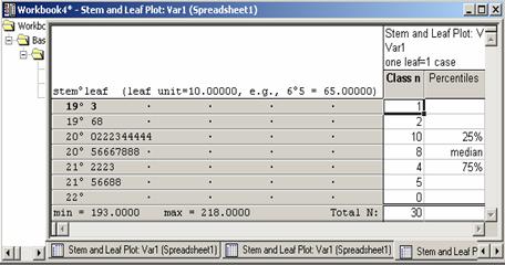
Stem-and-Leaf
Display for the Coating Weight Data
|
Stem |
Leaf |
Frequency |
|
19 |
3 6 8 |
3 |
|
20 |
0 2 2 2 3 4 4 4 4 4 5 8 8 8 6 6 6 7 |
18 |
|
21 |
2 2 2 3 5 6 6 8 8 |
9 |
|
Total |
|
30 |
Example 2.3: A sample of n = 25 Job CPU Times (in seconds) is selected from 1000 CPU times (See Mendenhall and Sincich, 1995, 25).
|
1.17 |
1.61 |
1.16 |
1.38 |
3.53 |
1.23 |
3.76 |
1.94 |
0.96 |
|
4.75 |
0.15 |
2.41 |
0.71 |
0.02 |
1.59 |
0.19 |
0.82 |
0.47 |
|
2.16 |
2.01 |
0.92 |
0.75 |
2.59 |
3.07 |
1.40 |
|
|
Construct a Stem and Leaf Plot of the data.
Step 1: Divide each observation, in the sample into two parts, the stem and the leaf. For 3-digit observations, there would be two choices:
- stem = first digit, leaf = last two digits
- stem = first two digits, leaf = third digit
For the CPU data, the first choice would be better.
Step 2: List the stems in order in a column.
Step 3: Proceed through the data set, placing the leaf for each observation in the appropriate stem or row.
The first entry corresponds to 0.02, the second to 0.15 and so on. It is not a bad idea to put decimal in the place it occurs in the sample though it is not popular.
Ordered
Stem-and-Leaf Display for the CPU Data
|
Stem |
Leaf |
Frequency |
|
0 |
02 15 19 47 71 75 82 92 96 |
9 |
|
1 |
16 17 23 38 40 59 61 94 |
8 |
|
2 |
01 16 41 59 |
4 |
|
3 |
07 53 76 |
3 |
|
4 |
75 |
1 |
|
Total |
|
25 |
Stem-and-Leaf Plot Using Statistica (ANOVA/MANOVA Module)
To construct stem-and-leaf plot by Statistica, first create a data sheet then enter the entire data in one column. To obtain Stem-and-leaf diagram for the galvanized coating weight data in Example 2.2, enter the data in one column (say Var1), follow the steps to construct a stem-and-leaf plot for the data:
- Statistics / Basic Statistics / Tables (you will get Figure 2.1)
- Descriptive Statistics / OK
- Variables (select Var1) / OK
- In Descriptive Statistic Spreadsheet, click Normality (you will get Figure 2.2)
- Stem & leaf plot (you will get Figure 2.3).
Note: Sometimes all the digits under stem and leaf will be zeros which can be avoided by checking Compressed in Figure 2.2.
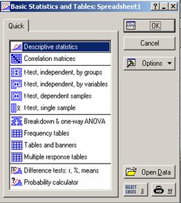
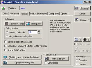
Figure 2.2 Descriptive
Statistics
Figure 2.1 Basic Statistics and
Tables
.
Figure 2.3 Stem and leaf Plot
These steps result in the stem and leaf plot as shown in Figure 2.3. For example, the second row contains 196 and 198. Note that the seventh row contains no value. This should not be mistaken for 220.
Dot plot
A dot plot is constructed by first drawing a horizontal scale that spans the range of the data. The observations are located on the horizontal scale by placing a dot over the appropriate value. If the observations repeat, then dots are placed on top of each other, forming a pile against that particular observation.
Example 2.4: The following data represents the yields of 15 one-acre plots.
67 61 62 65 61 60 55 61 62 57 64 60 58 62 67
Construct a dot plot for the above data.
. .
. . .
: : :
. . :
---+---------+---------+---------+---------+---------+---
55.0 57.5
60.0 62.5 65.0
67.5 Dot plot
2.4
Frequency Tables
When summarizing a large set of data it is often useful to classify the data into classes or categories and to determine the number of individuals belonging to each class, called the class frequency. A tabular arrangement of data by classes together with the corresponding frequencies is called a frequency distribution or simply a frequency table. Consider the following definitions:
Class Width: The difference between the upper and lower class limits of a given class.
Frequency: The number of observations in a class.
Relative Frequency: The ratio of the frequency of a class to the total number of observations in the data set.
Cumulative Frequency: The total frequency of all values less than the upper class limit.
Relative Cumulative Frequency: The cumulative frequency divided by the total frequency.
Example 2.5: Consider the data in Example 2.2. The steps needed to prepare a frequency distribution for the data set are described below:
Step 1: Range = Largest observation – Smallest observation
=![]() .
.
Step 2: Divide the range
between into classes of (preferably) equal width. A rule of thumb for the
number of classes is ![]() .
.
Class width![]()
Since we have a sample of size
30, the number of classes in the histogram should be around ![]() . In this case, the class width would be approximately
. In this case, the class width would be approximately ![]() . The smallest observation is 193. The first class boundary
may well start at 193 or little below it, say at 190 (just to avoid the
smallest observation, in general, falling on the class boundary). Thus the
first class is given by (190, 195]. The second class is given by (195, 200].
Complete the class boundaries for all classes. In Statistica, the lower
boundary of the first class is called the starting point while the class width
is called the step size.
. The smallest observation is 193. The first class boundary
may well start at 193 or little below it, say at 190 (just to avoid the
smallest observation, in general, falling on the class boundary). Thus the
first class is given by (190, 195]. The second class is given by (195, 200].
Complete the class boundaries for all classes. In Statistica, the lower
boundary of the first class is called the starting point while the class width
is called the step size.
Step 3: For each class, count the number of observations that fall in that class. This number is called the class frequency.
Step 4: The relative frequency of a class is calculated by f/n where f is the frequency of the class and n is the number of observations in the data set.
Cumulative Relative Frequency of a class, denoted by F, is the total of the relative frequencies up to that class. To avoid rounding in every class, one may accumulate the frequencies up to a class and then divide by n. The resulting quantity Relative Cumulative Frequency (F/n) is just the same as Cumulative Relative Frequency and is desirable in a frequency table. For the data in Example 2.2, we have the following frequency distribution:
|
Class |
Count |
f |
F |
Relative f |
Relative F |
|
|
|
|
|
|
|
|
|
|
|
|
|
|


To construct a frequency distribution using Statistica, first create a data sheet and enter the data in one column and follow the steps:
- Statistics/Basic Statistics/Tables
- Descriptive Statistics/OK
- Variables/Select variables(Say Var1) / OK
- In Quick, click Frequency tables. These Steps give the frequency table in Fig 2.4.
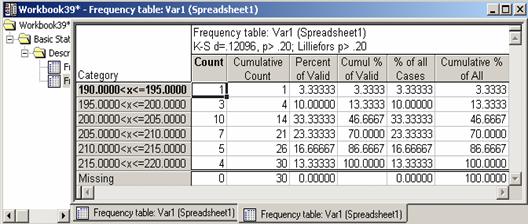
Figure
2.4 Frequency Table
2.5
Graphs of Frequency Distributions
Frequency Histogram
A frequency histogram is a bar diagram where a bar against a class represents frequency of the class.
To construct a frequency histogram for the data in example 2.2 using Statistica, follow the same steps for Frequency Distribution in Section 2.4 and replace Step 4 with Histograms. This should result in the histogram shown in Figure 2.5 below for the same data.
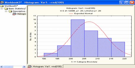
Figure 2.5 Histogram
Frequency Tables under the
Basic Statistics and Tables Module
If you go to Statistics/Basic statistics/Tables/Frequency tables then press OK, it will open The Frequency Tables Menu. One advantage of this menu is that it allows flexibility in the construction of frequency distributions and frequency histograms. One can change the step size and the starting point of the range of a variable in preparing a frequency distribution or plotting a histogram. To construct a frequency histogram for our data above with a step size of 10 and starting point of 185, follow the steps:
- Statistics/ Basic Statistics/Tables
- Frequency tables/OK
- Variables (select variable)/OK
- In Frequency table spreadsheet, click Advanced (you will get Figure 2.6)
- Check step size (enter 10)
- Uncheck at minimum
- Enter 185 for starting at
- Histogram (see Figure 2.7).
Alternatively, if we wish to construct the frequency histogram starting from the minimum value, we will eliminate steps (6 and 7) above. For a frequency distribution, we follow the same steps and replace Step 8 with Summary: Frequency Tables.
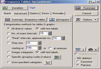
Figure 2.6 Frequency
Table
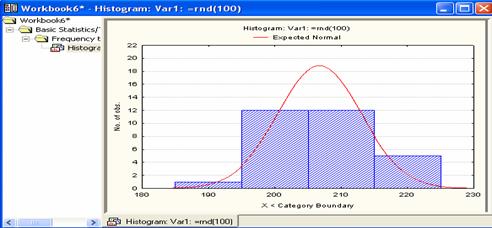
Figure 2.7 Histogram
Frequency Plots
The data of Example 2.2 have been summarized by a frequency distribution in Figure 2.4. We may use Figure 2.4, frequency distribution to find the midpoint, then enter the midpoint of each interval in one column in the datasheet, another column to enter the count (frequency) of each interval (relative frequencies, cumulative relative frequencies can also be entered in two other columns).
Use frequency or relative frequency or cumulative relative frequency as vertical axis as needed by the graph.
(a) Frequency Plot: If frequencies of classes are plotted against the mid values of respective classes, the resulting scatter graph is called a Frequency Plot. To use Statistica, follow the steps:
- Graphs/ 2D graphs/Scatterplots
- Variables (choose variables, count for y and midpoint for x) / OK
- Click advanced
- Choose regular (under graph type) and off (under fit)
- OK, which should give figure 2.8.
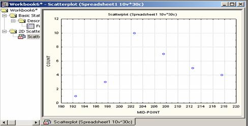
Figure 2.8 Frequency
Plots
(b) Frequency Curve: If the dots of the frequency plot are joined by a smooth curve the resulting curve is called a frequency curve.
(c) Frequency Polygon: If the dots in a frequency plot are joined by lines, the resulting graph is called a Frequency Polygon. The polygon is sometimes extended to the midpoints of extreme adjacent classes (in both sides) with no frequencies.
To get the Frequency Polygon for
the data in Example 2.2, follow the steps:
- Graphs / 2D graph / Line plots (Variables)
- Click Advanced, Choose xy trace (under graph type) and Off (under Fit)
- Variables (choose variables) / OK / OK, which should give figure 2.9.
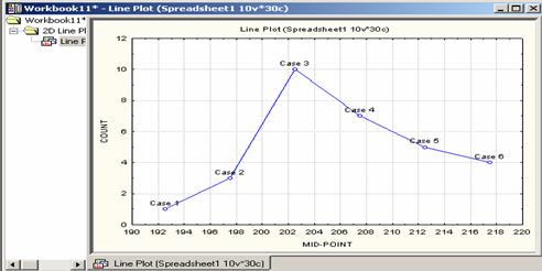
Figure 2.9 Frequency
Polygon
(d) Relative Frequency Plot: If relative frequencies of classes are plotted against the mid values of respective classes, the resulting scatter graph is called a Relative Frequency Plot.
(e) Relative Frequency Curve: If the dots of the Relative Frequency Plot are joined by a smooth curve, the resulting curve is called a Cumulative Relative Frequency Curve. It is ideally done for large sample size and smaller class widths of class intervals.
(f) Relative Frequency Polygon: If midpoints of the dots in a frequency plot are joined by lines, the resulting graph is called a frequency polygon. The polygon is extended to the midpoints of extreme adjacent classes (in both sides) with no relative frequencies.
(g) Cumulative Relative Frequency Histogram: cumulative relative frequency is the same as relative cumulative frequency. Area of a bar should represent the cumulative relative frequency. Thus the height of a bar is the ratio of cumulative relative frequency and class width. If every class has the same width, then the height of a bar of a class is proportional to the cumulative relative frequency of that class.
(h) Cumulative Relative Frequency Plot: If cumulative relative frequencies (divided by the class width in case of unequal class widths) of classes are plotted against the upper limits of the respective classes, the resulting scatter graph is called a Cumulative Relative Frequency Plot.
2.6
The Bar Chart and the Pie Chart
Both bar and pie charts are used to represent discrete and qualitative data.
Bar Chart
A bar chart gives the frequency
(or relative frequency) corresponding to each category, with the height or
length of the bar proportional to the category frequency (or relative
frequency). To make a bar chart, the
classes are marked along the horizontal axis and a vertical bar of height equal
to the class frequency is drawn over the respective classes.
Example 2.6: Consider the following example of different brands of disks:
|
Sony |
Imation |
Verbatim |
Imation |
Verbatim |
Sony |
Verbatim |
Sony |
|
Verbatim |
Verbatim |
Sony |
Verbatim |
Verbatim |
Verbatim |
Sony |
Verbatim |
|
Sony |
Verbatim |
Sony |
Verbatim |
Sony |
Verbatim |
Verbatim |
Verbatim |
|
Verbatim |
Verbatim |
Verbatim |
Sony |
Verbatim |
Verbatim |
Verbatim |
Verbatim |
|
Verbatim |
Verbatim |
Verbatim |
Verbatim |
Verbatim |
Verbatim |
Sony |
Imation |
|
Sony |
Verbatim |
Imation |
Verbatim |
Sony |
Sony |
Verbatim |
Verbatim |
|
Verbatim |
Verbatim |
Verbatim |
Sony |
Verbatim |
Verbatim |
Sony |
Sony |
|
Verbatim |
Sony |
Verbatim |
Verbatim |
Verbatim |
Verbatim |
Verbatim |
Verbatim |
|
Sony |
Verbatim |
Sony |
Verbatim |
Verbatim |
Sony |
Verbatim |
Verbatim |
|
Verbatim |
Verbatim |
Verbatim |
Sony |
Imation |
Verbatim |
Verbatim |
Imation |
|
Imation |
Verbatim |
Verbatim |
Verbatim |
Verbatim |
Verbatim |
Sony |
Verbatim |
|
Verbatim |
Verbatim |
Sony |
Verbatim |
Verbatim |
Sony |
Verbatim |
Sony |
|
Verbatim |
Imation |
Verbatim |
Sony |
Verbatim |
Verbatim |
Verbatim |
Verbatim |
|
Sony |
Verbatim |
Sony |
Verbatim |
Verbatim |
Sony |
Imation |
Imation |
|
Verbatim |
Verbatim |
Verbatim |
Sony |
Verbatim |
Verbatim |
Verbatim |
Verbatim |
|
Verbatim |
Verbatim |
Verbatim |
Verbatim |
Sony |
Verbatim |
Sony |
Sony |
|
Sony |
Verbatim |
Verbatim |
Verbatim |
Verbatim |
Imation |
Verbatim |
Verbatim |
|
Verbatim |
Imation |
Verbatim |
Verbatim |
Verbatim |
Verbatim |
Verbatim |
Sony |
To draw a Bar Chart using Statistica, we first construct a frequency distribution by following the steps:
- Add number of cases up to 144 “ size of the sample”
- Input the sample “name of disks” in one column
- Statistics / Basic Statistics and Tables
- Frequency Table / OK
- In Frequency Tables spreadsheet, choose Advanced
- Click Variables, select variable (Say VAR1) / OK
- In Categorization methods for tables & graphs select Specific grouping code (Values), then click the icon to the right of it
- Press ALL / OK
- Press Summary Frequency Tables, to get the frequency table below.
|
Floppy Disk |
Frequency |
Relative Frequency |
|
Imation |
12 |
0.083 |
|
Sony |
36 |
0.250 |
|
Verbatim |
96 |
0.667 |
|
Total |
144 |
1.000 |
To graph the bar chart, put the above frequency in Var5 and the names
in Var4, and then do the following (make sure that there are not more
than three cases):
- Graphs/ 2D
Graphs / Bar/Column Plots
- Click
Variables (select the Variable Var 5)/OK
- In Quick,
choose (regular “under graph type”)
- Click Options
1(you will get Figure 2.10)
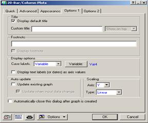
Figure 2.10 2d
Bar/Column Plots
- Under Display
options, in Case label choose variable
- Click
variable (select Var4)/OK
- OK (to get
Figure 2.11).
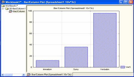
Figure 2.11 Bar/Column
Plots
Pie chart
A Pie chart is made by representing the relative frequency of a category by an angle of a circle determined by:
Angle of a category = Relative frequency of
the category ![]()
Example 2.7: For the data
in Example 2.6, and by using the Frequency Table, a pie chart can be drawn
using Statistica by following the steps:
- Graphs/ 2D Graphs/Pie charts
- To get Figure 2.12, Click Advanced
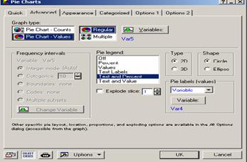
Figure 2.12 Pie
Charts Pane
- Variables “select the variable Say Var5” /OK
- Under Graph Type choose Pie chart-Values / Regular
- Under Pie Legend, choose “Text and Percent “
- Under Pie
Labels (values) choose variable/Click variable (select Var4)/OK
- OK (to get Figure 2.13).
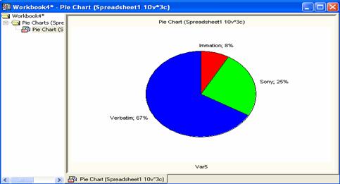
Figure
2.13 Pie Chart
2.7 Numerical Measures
Sometimes we are interested in a
number which is representative or typical of the data set. The mean and the
median are such numbers. Similarly, we define the range of the data which gives
some idea about the variation or dispersion of observations in the data. The
most important measure for dispersion is the sample standard deviation.
Measures of Location
Population
Mean: The population mean is denoted by ![]() , and for a finite population is defined by
, and for a finite population is defined by
![]() where
the
where
the ![]() ’s are the population values
’s are the population values
Sample
Mean: The mean ![]() of a sample is the
average of the observations
of a sample is the
average of the observations ![]() in the sample. It is given by:
in the sample. It is given by:
![]()
Example
2.8 Consider a sample of bottle
bursting strength data of a set of 5 soft drink bottles
|
251 |
255 |
254 |
253 |
252 |
The sample mean is given by ![]() .
.
Sample Median: The median of a
sample of ![]() observations
observations ![]() is the middle
observation when the observations are arranged in ascending or descending order
if the number of observations is odd. If the number of observations is even, it
is the average of the middle two observations. In other words, for any sample of size
is the middle
observation when the observations are arranged in ascending or descending order
if the number of observations is odd. If the number of observations is even, it
is the average of the middle two observations. In other words, for any sample of size ![]() , the median
, the median![]() is given by
is given by

For
the bottle bursting strength data, the median is 253. There are 2 observations
below it and 2 above it.
Example
2.9 Marks obtained by 6 students in
STAT 319 are given by
81 82
98 83 80 85.
The ordered sample observations
are 80 81 82
83 85 98, so that the median is ![]() .
.
Mode: The mode of a sample
is the observation occurring the maximum number of times i.e. the observations
with the largest frequency.
Example
2.10 The following samples provide
prices, in Saudi Riyals (SR), of a computer monitor.
(a) 1200, 1000, 1500, 1200, 1000, 1200
(b) 1300, 1200, 1000
What is the modal price?
Solution: (a) The modal price is SR1200.
(b) There is no modal price.
Example
2.11 The following table shows the
hourly wages in SR earned by the employees of a small company and the number of
employees who earn each wage.
|
Wages/hour |
6 |
8 |
10 |
13 |
|
Number of employees |
3 |
5 |
4 |
4 |
The
modal wage per hour is 8 SR.
Measures of Variability
Population Variance: The variance of a
population is denoted by
![]() , when
, when ![]() is finite
is finite
Sample
Variance: For a sample of size![]() , the variance, denoted by
, the variance, denoted by![]() , is the Total Sum of Squares (TSS) of
observations around their mean divided by
, is the Total Sum of Squares (TSS) of
observations around their mean divided by ![]() . That is
. That is
![]() .
.
Note that TSS can also be written as
 .
.
Standard
Deviation: The standard deviation is the positive
square root of the variance and is given by
 (for the population)

 (for the sample)
For example, the standard deviation for the
data in Example 2.8 is given by
![]()
![]() .
.
Percentiles
The ![]() percentile
percentile ![]() is the value that
exceeds
is the value that
exceeds ![]() of the data, and is obtained
by the following steps:
of the data, and is obtained
by the following steps:
Step 1: Determine![]() .
.
Step 2: Separate ![]() (the largest
integer not exceeding
(the largest
integer not exceeding![]() ) and the
decimal part
) and the
decimal part ![]() of
of ![]() and write
and write![]() .
.
Step 3: Order the observations in an ascending manner.
Step 4: The ![]() percentile is then
given by
percentile is then
given by
![]() ,
,
where ![]() is the ith
observation after ordering the observations ascendingly.
is the ith
observation after ordering the observations ascendingly.
The 25th
percentile is called the 1st quartile and is denoted by ![]() .
.
The 50th percentile is called the 2nd
quartile and is denoted by ![]() .
.
The 75th percentile is called the 3rd
quartile and is denoted by ![]() .
.
Example 2.12 (cf. Vinning, 1998, 193). An independent consumer group tested radial tires from a major brand to determine expected tread life. The data (in thousands of miles) are given below:
50 54 52 47 56 51 51
48 56 53 43 56 58 42
Find the 1st, 2nd and 3rd quartiles .
The ordered sample observations are given by
42 43 47 48 50 51 51
52 53 54 56 56 56 58
The ranks of the quartiles are:
![]()
![]()
![]()
so that the quartiles are given by:
![]()
![]()
![]() .
.
The Empirical Rule (ER)
If the relative frequency of the data is approximately mound shaped (i.e. bell shaped), then
1.
Approximately 68% of the measurements
will lie within 1 standard deviation of their mean, i.e. within the interval ![]() for a population,
for a population, ![]() for a sample.
for a sample.
2.
Approximately 95% of the measurements
will lie within 2 standard deviations of their mean, i.e. within the interval![]() for a population,
for a population, ![]() for a sample.
for a sample.
3.
Almost all the measurements (i.e. 100%) will lie within
3 standard deviations of their mean, i.e. within the interval![]() for a population,
for a population, ![]() for a sample.
for a sample.
A population/sample satisfying the above three properties is said to satisfy the empirical rule, though in many cases, it may not guarantee a bell shaped distribution.
Example 2.13 The
observations in Example 2.3 are reproduced in ascending order:
0.02 0.15 0.19 0.47 0.71 0.75 0.82 0.92 0.96 1.16
1.17 1.23 1.38 1.40 1.59 1.61 1.94 2.01 2.16 2.41
2.59 3.07 3.53 3.76 4.75
For the data, we have ![]()
1.
The interval ![]() contains 18
observations which leads to the proportion
contains 18
observations which leads to the proportion![]() which is not close to 68% as expected by the Empirical Rule.
Since the rule is violated, we say ER is not satisfied by the sample.
which is not close to 68% as expected by the Empirical Rule.
Since the rule is violated, we say ER is not satisfied by the sample.
2.
The interval ![]() contains 24
observations which leads to the proportion
contains 24
observations which leads to the proportion![]() which is not far from 95% as expected by the Empirical Rule.
which is not far from 95% as expected by the Empirical Rule.
3.
The interval ![]() contains all 25
observations which lead to the proportion
contains all 25
observations which lead to the proportion![]() which is exactly the same as expected by the Empirical Rule.
which is exactly the same as expected by the Empirical Rule.
If all the three rules are
approximately satisfied by the sample, we say that the rule is satisfied. Thus,
for this data set the empirical rule is not satisfied.
Coefficient of Variation
The sample coefficient of variation relates
variability in the sample to the mean. It is defined by
![]() .
.
Example 2.14
Suppose that calibration inspection time based on a sample of 100
observations has a mean of 14.342 and standard deviation 1.72 (Lapin, 1997,
p22). The coefficient of variation of the sample given by
![]()
It indicates that the sample standard deviation is only 12%
as large as the mean. Since our sample yields a ![]() , therefore we conclude that the sample does not have much
variation relative to the mean.
, therefore we conclude that the sample does not have much
variation relative to the mean.
Coefficient of
Skewness
A measure of skewness indicates the direction of the relative frequency distribution, either skewed to lower values or higher values. The sample coefficient of skewness is given by
![]() .
.
A negative value of ![]() implies that the
relative frequency distribution is negatively skewed (left tailed distribution)
while a positive value of
implies that the
relative frequency distribution is negatively skewed (left tailed distribution)
while a positive value of ![]() implies that the
relative frequency distribution is positively skewed (right tailed
distribution).
implies that the
relative frequency distribution is positively skewed (right tailed
distribution).
For the CPU data in Example 2.13
the coefficient of skewness is given by:
![]()
which indicates that the sample is positively
skewed, i.e. the relative frequency histogram has a long right tail.
Proportion
The population proportion is defined as ![]() , where X is the number of observations in the population
possessing a particular characteristic, and N is the population size. The
sample proportion is given by
, where X is the number of observations in the population
possessing a particular characteristic, and N is the population size. The
sample proportion is given by![]() where
where ![]() is the sample size,
is the sample size, ![]() is the number of
observations possessing that particular characteristic in the sample.
is the number of
observations possessing that particular characteristic in the sample.
In
a statistics course 30 students sat for final exam, 6 got ![]() , 3 failed and the rest got other grades
, 3 failed and the rest got other grades ![]() . Then the proportion of students who got
. Then the proportion of students who got ![]() is
is ![]() , and the proportion of failing students is
, and the proportion of failing students is ![]() .
.
2.8 Descriptive Statistics Using
Statistica
To do the descriptive statistics of the data given in Example 2.2, enter the data in one column, make sure that there are no more than 30 cases. Follow the steps below:
- Statistics / Basic Statistisc / Tables
- Select Descriptive Statistics/Tables / OK
- Click Advanced in Descriptive Statistics Spreadsheet to get Figure 2.14
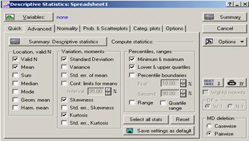
Figure 2.14 Descriptive
Statistics Spreadsheet
- Variables/ select variable(Say Var1)
- Select desired statistics
- Click Summary
If Valid N, Mean, Maximum and Minimum, Std. Dev., Lower and Upper Quartiles, Skewness and Kurtosis were selected for one sample in step (5), then we would have the Spreadsheet given by Figure 2.15.
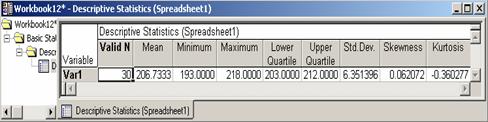
Figure 2.15 Computed
Descriptive Statistics
2.9
The Box Plot
A box aligned with the first and the third quartiles as edges, median at the appropriate place in the scale is called a box plot. It is extended to both directions up to the smallest and the largest values. These extensions may be called arms. This technique displays the structure of the data set by using the quartiles and the extreme values of a sample.
The following intervals, called inner fences and outer fences, are used to detect outliers.
Inner fences: ![]()
![]()
Outer fences: ![]()
![]()
where ![]() is the
interquartile range and
is the
interquartile range and ![]() are Lower and Upper Inner Fence and
are Lower and Upper Inner Fence and ![]() are Lower and Upper Outer Fence.
are Lower and Upper Outer Fence.
Observations that fall within the inner fence and outer fence are deemed to be suspected outliers and those falling outside the outer fence are highly suspect outliers (Sincich, 1992).
Example 2.14 Construct the Box plot with the CPU data in Example 2.3.
Solution: The
quartiles are given by
![]() ,
,
![]() ,
,
![]() ,
,
![]()
The Inner Fences are given by![]() i.e.
i.e.![]() while the Outer Fences are given by
while the Outer Fences are given by ![]() i.e.
i.e.![]() . Clearly the
observation 4.75 in the CPU data is a suspect outlier by the inner Fence
Method.
. Clearly the
observation 4.75 in the CPU data is a suspect outlier by the inner Fence
Method.
Since the second quartile ![]() is closer to the first
quartile
is closer to the first
quartile ![]() than it is to the third quartile
than it is to the third quartile ![]() i.e.
i.e. ![]() , the distribution is positively skewed.
, the distribution is positively skewed.
With the data in one column in the Basic Statistics Module in Statistica, one can construct a box plot by following the steps:
- Statistics/Basic Statistics/Tables
- Descriptive Statistics/OK
- Variables/Select variable (Var3) /OK
- From the choices appeared in the Descriptive Statistics spreadsheet (Quick, Advanced,…, Options), Click Options (there are four types of Box-Whisker plots available in the package)
- Choose
- Click Quick
- Box & Whisker plot for all variables.
These steps will give two graphs,
one of them as standard containing Mean/SD/1.96*SD, and the other containing
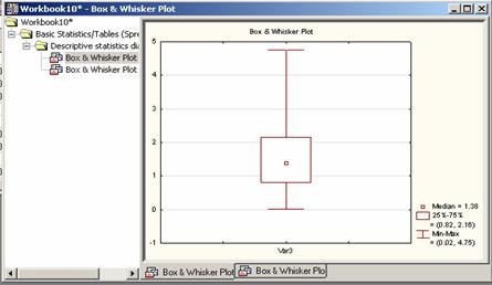
Figure 2.16 Box-Whisker
Plot
2.10 Approximate Mean and Variance of Grouped
Data
The CPU data in Example 2.3 has been used to make the following frequency distribution.
|
Class |
Class Interval |
Midvalue |
f |
Relative f |
F |
Relative F |
|
1 |
[0, 1) |
0.5 |
9 |
0.36 |
9 |
0.36 |
|
2 |
[1, 2) |
1.5 |
8 |
0.32 |
17 |
0.68 |
|
3 |
[2, 3) |
2.5 |
4 |
0.16 |
21 |
0.84 |
|
4 |
[3, 4) |
3.5 |
3 |
0.12 |
24 |
0.96 |
|
5 |
[4, 5) |
4.5 |
1 |
0.04 |
25 |
1.00 |
The above table is ‘equivalent’
to CPU data with mid-values as given below:
0.5 0.5 0.5 0.5 0.5
0.5 0.5 0.5 0.5
1.5 1.5 1.5 1.5 1.5 1.5 1.5 1.5
2.5 2.5 2.5 2.5
3.5 3.5 3.5
4.5
The sample mean of the above
sample can now be calculated by the usual formula
![]() .
.
Note the discrepancy between
the sample mean (1.63) calculated from the ungrouped data in Example 2.3 and
the sample mean (1.66) calculated from the grouped data. The expression for the
mean can also be written by the distinct numbers as
![]()
where k is the number of classes in the Frequency Table.
The sample variance can be
calculated as follows:

Thus, for the data consisting
of the above mid-vales we have![]() .
.
Exercises
2.1 Refer to Example 2. 1, do the following:
(a) Select a SRS of size 12 using a random number table.
(b) Select a SRS of size 20 using Statistica.
(c)
Construct a frequency distribution using
the class intervals ![]() and so on.
and so on.
(d) Draw the histogram corresponding to the frequency distribution in part (a). How would you describe the shape of this histogram?
(e) Draw a stem and leaf plot for the above data.
(f) Draw a box plot and comment on the symmetry and shape of the data.
2.2 (cf. Devore, J. L. and Peck, R., 1997, 72). The paper “The Pedaling Technique of Elite Endurance Cyclists” (Int. J. of Sport Biomechanics (1991, pp. 29-53) reported the accompanying data on single-leg power at a high workload.
244 191 160 187 180 176 174 205 211 183 211 180 194 200
(a) Find the mean, median, standard deviation, variance, lower and upper quartiles, range inter quartile range, coefficient of variation, co-efficient of skewness for the above data.
(b) Do the data satisfy the empirical rule?
2.3
(cf.
562 869 708 775 775 704 809 856 655 806 878 909
918 558 768 870 918 940 946 661 820 898 935 952
957 693 835 905 939 955 960 498 653 730 753.
(a) Calculate the following summary statistics for this sample Mean, median, standard deviation, variance, co-efficient of variation, co-efficient of skewness, range, lower and upper quartiles, inter-quartile range.
(b) Construct the box plot.
2.4 (Montgomery, D. C., et. al, 2001, 25-26). The following data are the compressive strengths in pounds per square inch (psi) of 80 specimens of a new aluminum-lithium alloy undergoing evaluation as a possible material for aircraft structural elements.
105 221 183 186 121 181 180 143 97 154 153 174 120 168 167 141
245 228 174 199 181 158 176 110 163 131 154 115 160 208 158 133
207 180 190 193 194 133 156 123 134 178 76 167 184 135 229 146
218 157 101 171 165 172 158 169 199 151 142 163 145 171 148 158
160 175 149 87 160 237 150 135 196 201 200 176 150 170 118 149
(a) Construct a frequency distribution and a frequency histogram starting from 70 and the step size 20.
(b) Construct a stem and leaf plot.
2.5 Refer to Exercise 2.1 draw a random sample of size 20 using the random number table at the end of your manual.
(a) With replacement
(b) Without replacement.
2.6
(cf. Johnson, R. A., 2001, 53). The
following measurements of the diameters (in feet) of Indian mounds in southern
22 24 24 30 22 20 28 30 24 34 36 15 37
(a) Find the upper and lower quartiles and 90th percentile for the above data.
(b) Find the range and the inter quartile range of this data.
(c) Calculate the mean, median & standard deviation.
(d) Find the proportion of the observations that are in the intervals
![]()
(e) Compare the results in part (d) with the empirical guidelines.
(f) Display the data in the form of a box plot.
2.7 (Johnson, R. A., 2000, 22). Consider the following humidity readings rounded to the nearest percent:
29 44 12 53 21 34 39 25 48 23
17 24 27 32 34 15 42 21 28 37
(a) Construct a frequency distribution and histogram starting from 10 and with a width (step size) of the intervals 10.
(b) Construct a stem and leaf plot of the above data.
2.8 (Devore, J. L. and Farnum, N. R., 1999, 16). Corrosion reinforcing steel is a serious problem in concrete structures located in environments affected by severe weather conditions. For this reason researchers have been investigating the use of reinforcing bars made of composite material. One study was carried out to develop guidelines for bonding glass-fiber-reinforced plastic rebars to concrete. Consider the following 48 observations on measured bond strength:
11.5 12.1 9.9 9.3 7.8 6.2 6.6 7.0 13.4 17.1 9.3 5.6
5.7 5.4 5.2 5.1 4.9 10.7 15.2 8.5 4.2 4.0 3.9 3.8
3.6 3.4 20.6 25.5 13.8 12.6 13.1 8.9 8.2 10.7 14.2 7.6
5.2 5.5 5.1 5.0 5.2 4.8 4.1 3.8 3.7 3.6 3.6 3.6
(a) Construct a stem-and-leaf display for these data.
(b) Construct a frequency distribution and histogram, starting from 2 and with a step size 2.
2.9 (cf. Montgomery, D. C., et. al, 2001, 25). In Applied Life Data Analysis (Wiley, 1982), Wayne Nelson presents the break-down time of an insulating fluid between electrodes at 34 kV. The times in minutes, are as follows:
0.19 0.78 0.96 1.31 2.78 3.16 4.15 4.67 4.85 5.81
6.50 7.35 8.01 8.27 12.06 13.75 32.52 33.91 36.71 72.89
(a) Calculate the sample average and the sample standard deviation.
(b) Calculate the coefficient of variation and coefficient of skewness.
2.10 (cf. Montgomery, D. C., et. al, 2001, 25). An article in the Journal of Structural Engineering (1989, p115) describes an experiment to test the yield strength of circular tubes with caps welded to the ends. The first yields (in kN) are
96 102 102 102 104 104 108 126 126 128 128 140 156 160 160 164 170
Calculate the sample median, upper and lower quartile and construct a box plot.
2.11 (cf. Montgomery, D. C., et. al, 2001, 25). The data on visual accommodation (a function of eye movement) when recognizing a speckle pattern on a high resolution CRT screen is as follows:
36.45 67.90 38.77 42.18 26.72 50.77 39.30 49.71 67.90
38.77 42.18 26.72 50.77 39.30 67.90 38.77 42.18 26.72
50.77 39.30 67.90 38.77 42.18 26.72 50.77 39.30 29.12
(a) Calculate the sample mean, median, mode, variance and the sample standard deviation.
(b) Calculate the coefficient of variation and coefficient of skewness and interpret these values.
(c) Prepare a stem-and-leaf plot of the above data and comment on the shape of the data.
(d) Construct a frequency histogram, and compare it with stem-and-leaf plot.
(e) Draw a cumulative relative frequency curve and determine the 40th percentile, the 70th percentile. Explain these quantities.
2.12 (cf. Montgomery, D. C., et. al, 2001, 30). The following data are the numbers of cycles to failure of aluminum test coupons subjected to repeated alternating stress at 21,000 psi, 18 cycles per second:
1115 1567 1223 1782 1055 1310 1883 375 1522 1764
1540 1203 2265 1792 1330 1502 1270 1910 1000 1608
1258 1015 1018 1820 1535 1315 845 1452 1940 1781
1085 1674 1890 1120 1750 798 1016 2100 910 1501
1020 1102 1594 1730 1238 865 1605 2023 1102 990
2130 706 1315 1578 1468 1421 2215 1269 758 1512
1109 785 1260 1416 1750 1481 885 1888 1560 1642
(a) Construct a stem-and-leaf display for these data.
(b) Construct a frequency distribution and histogram, starting from 750 and with a step size 200.
(c) Is the empirical rule satisfied?
2.13 (cf. Montgomery, D. C., et. al, 2001, 2001, 42). The pH of a solution is measured eight times by one operator using the same instrument. She obtains the following data:
7.05 7.20 7.18 7.19 7.20 7.15 7.20 7.18 7.19 7.20 7.21 7.16
7.15 7.20 7.08 7.19 7.25 7.21 7.16 7.15 7.20 7.18 7.19 7.20
7.21 7.16 7.21 7.16 7.15 7.26 7.18 7.19 7.20 7.21 7.16 7.19.
Calculate the following summary statistics: Mean, Median, Range, IQR, Standard Deviation and Variance.
2.14 (cf. Montgomery, D. C., et. al, 2001, 42). A sample of 30 resistors yielded the following resistances (ohms):
38 47 45 41 35 35 34 45 44 47 45 41 35 35 36
34 45 34 45 44 47 45 41 35 47 45 41 35 43 43
Compute summary statistics for this data.
2.15 (cf. Montgomery, D. C., et. al, 2001, 37). An article in the Transactions of the Institution of Chemical Engineers (1956, 34, 280-293) reported data from an experiment investigating the effect of several process variable on the vapor phase oxidation of naphathalene. A sample of percentage mole conversion of naphathalene to maleic anhydride follows:
4.2 4.7 5.0 3.8 3.6 3.0 5.1 3.1 3.8 4.8
4.0 5.2 4.3 2.8 2.0 2.8 3.3 4.8 5.0.
(a) Calculate the sample mean, variance, standard deviation, range, coefficient of
variation and skewness.
(b) Calculate the sample median, lower and upper quartiles, inter-quartile-range.
(c) Construct a box plot of the data.
2.16 (cf. Montgomery, D. C., et. al, 2001, 37). The following data are the temperatures of effluent at discharge from a sewage treatment facility on consecutive days:
43 47 51 48 52 50 46 49 45 52 46 51
44 49 46 51 49 45 44 50 48 50 49 50
(a) Calculate the sample mean, variance, standard deviation, range, coefficient of variation and skewness.
(b) Calculate the sample median, lower and upper quartiles, inter-quartile-range.
(c) Construct a box plot of the data.
(d) Find the 5th and 95th percentiles of the temperature.
(e) Construct a dot plot for the temperature data.
2.17 (Devore, J. L. and Farnum, N. R., 1999, 4-5). The tragedy that befell the space shuttle Challenger and its astronauts in 1986 led to a number of studies to investigate the reasons for mission failure. Attention quickly focused on the behavior of the rocket engine’s O-rings. Here is data consisting of observations on O-ring Temperature (°F) for each test firing or actual launch of the shuttle rocket engine (Presidential Commission on the Space Shuttle Challenger Accident, 1986, 1, pp.129-131).
84 49 61 40 83 67 45 66 70 69 80 58 68 60 67 72 73 70
57 63 70 78 52 67 53 67 75 61 70 81 76 79 75 76 58 31
(a) Prepare a dot plot of the sample.
(b) Construct a stem-and-leaf display for these data.
(c) Construct a frequency distribution and histogram, starting from 25 and with a step size 10.
2.18 (Devore, J. L. and Farnum, N. R., 1999, 18). In the manufacture of printed circuit boards, finished boards are subjected to a final inspection before they are shipped to customers. Here is data on the type of defect for each board rejected at final inspection during a particular time period:
|
Type of defect Frequency |
|
Low copper plating 112 |
|
Poor electrolyses coverage 35 |
|
Lamination problems 10 |
|
Plating separation 8 |
|
Etching problems 5 |
|
Miscellaneous 12 |
Make a bar chart and a pie chart of the above data.
2.19 (Devore, J. L., 2000, 18). Power companies need information about customer usage to obtain accurate forecast of demands. Investigators from Wisconsin Power and Light determined energy consumption (BTUs) during a particular period for a sample of 90 gas-heated homes. An adjusted consumption value was calculated as follows:
|
Class |
1-3 |
3-5 |
5-7 |
7-9 |
9-11 |
11-13 |
13-15 |
15-17 |
17-19 |
|
Frequency |
1 |
1 |
11 |
21 |
25 |
17 |
9 |
4 |
1 |
(a) Find mean, median, standard deviation, variance, lower and upper quartiles, range inter quartile range, co-efficient of variation, co-efficient of skewness for the above data.
(b) Does the Empirical Rule satisfy the above data?
(c) Construct a frequency histogram of the above data.